
Every week since the start of January I heard headlines like “3963 new infections, a bit more than average”. In context, that meant that the amount of positive COVID-19 that day was higher than the average daily amount of cases in the previous seven days. Even though we heard that every week, overall the cases were going down. What was going on? Well, somewhat unsurprisingly, the amount of reported cases was higher on weekdays than on Monday and in the weekend. The news site I linked above mentions the midweek-effect as well, but on Twitter and on the radio you mainly hear the headline, not the caveats.
Anyway, I wanted to see what the midweek-effect actually looked like. The daily infection data is available from the RIVM website, RIVM being the Dutch National Institute for Public Health and the Environment. I started by reproducing the graph they made, partly to check the file and partly for fun (see Fig. 1).
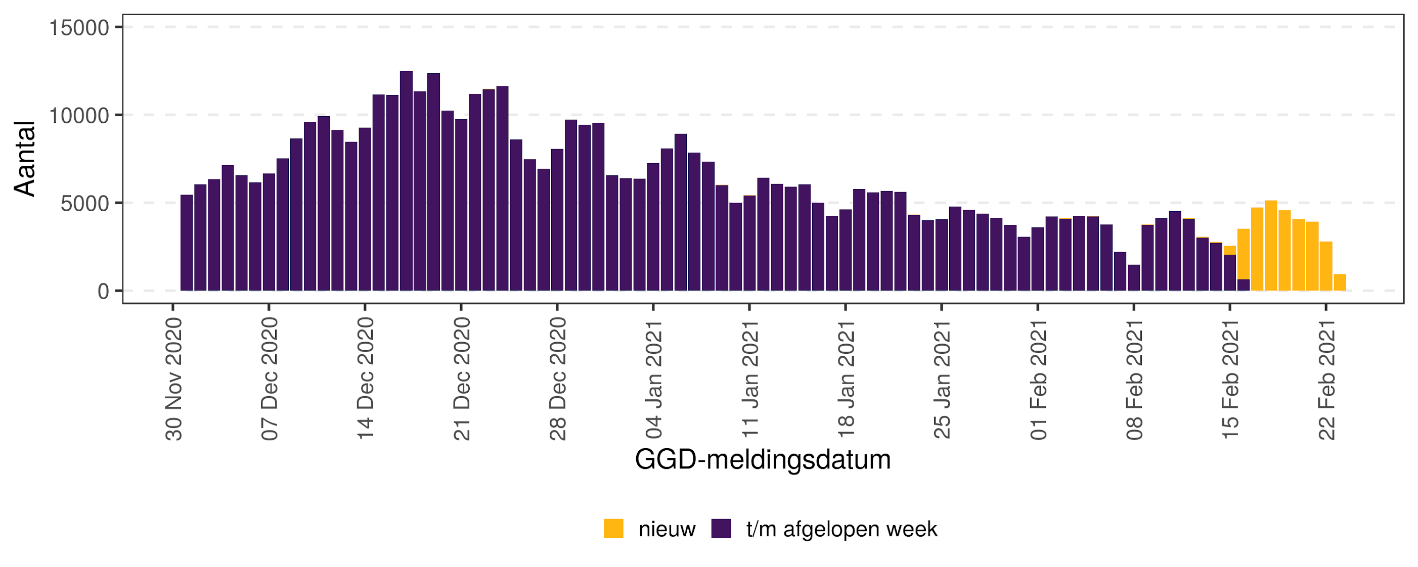
Figure 1: Amount of positive COVID-19 tests since the start of December. The date used is the date when the test result was reported to the GGD, the municipal health service. In yellow are the test results RIVM got this week, in purple previous data.
To decompose the various effects in this data, I used R’s stats::stl() function on a time series with frequency=7. This took a while to figure out, as a mis-configuration on my end of the time series led to STL interpreting each day as a season, instead of each week. Because the seasonal effect is multiplicative and not additive, I had to log-transform the data as well. This means the seasonal component has a higher amplitude when the overall amount of cases is higher (see Fig. 2).

Figure 2: Weekly component and general trend of positive COVID-19 tests, overlayed on daily data. The solid line indicates the overall trend, while the dashed line combines the overall trend with the seasonal component. Yellow still indicates test results from this week, purple the previous data.
In the end, this does not mean much at all. The accepted explanation of the midweek-effect has to do with when tests are carried out and reported; not when infections actually take place. If we look at the cases where the date of disease onset is available (source, Public Domain Mark 1.0), the weekly trend is less present (see Fig. 3).

Figure 3: Number of new confirmed cases per day of disease onset. The solid line indicates the overall trend, while the dashed line combines the overall trend with the seasonal component. The gray area show daily cases.
Comparing the two weekly trends, the midweek-effect of reported cases is higher than the weekly effect of the disease onset of cases. In addition, the latter peaks on Mondays and declines throughout the week before as opposed to the midweek-effect (see Fig. 4). Whether this effect is actually present or another artifact of data reporting is unclear to me.

Figure 4: Weekly component of reported cases and disease onsets. The solid line shows the pattern for the day of disease onset, the dashed line for the day when the test result is reported.


No comments:
Post a Comment