I recently updated the website of Citation.js. This involved getting rid of the Material Design Lite framework, simplifying and refreshing the site design and modernisering some of the code behind it. Additionally, I updated the content of the homepage, and added some functionality to the interface of the blog page and the demo.
Homepage
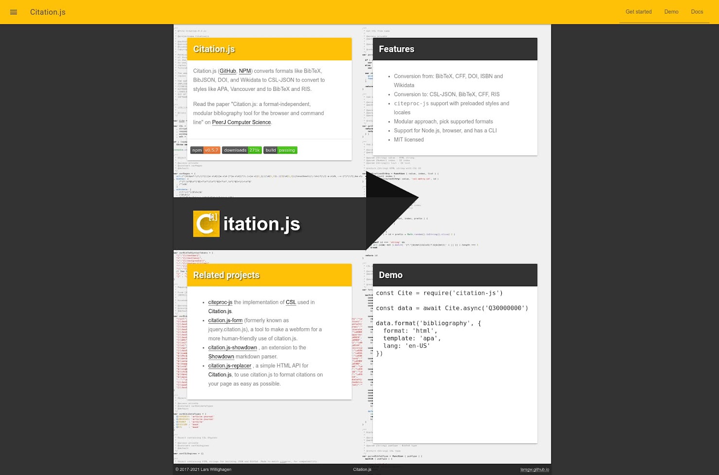
The old layout of the homepage had a dark grey background, with in the middle a grid of four cards with the main content of the site, and between the top and bottom row the Citation.js banner-variant logo. The grid of cards had a background of syntax-highlighted source code. This is actually the start of the Citation.js v2 code, which at that point still consisted of a single file. On the very top of the page was a yellow header and in the bottom a thin black footer.
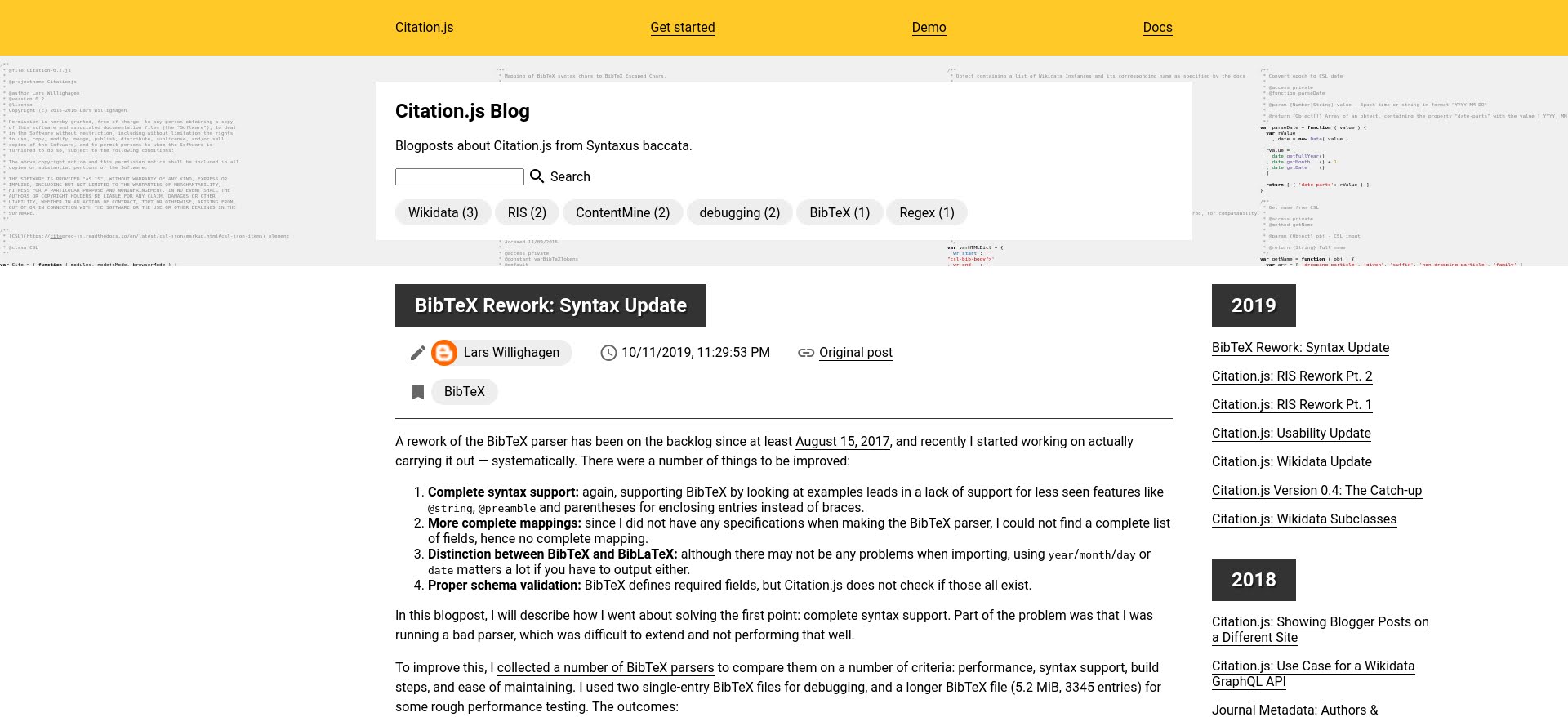
The new layout incorporates a lot of the design elements of the first design, but in a way that hopefully improves the readability and feel of the page. The yellow header remains but the links are centered instead of right-aligned. The footer is full-width (though the text is still centered) and has a larger font size and vertical padding. The grid is gone, instead the top of the page has a background of code in full-width with the banner logo and some introductory text. The other content is now aligned in a single row, and the cards are replaced with plain text, although the headers still have white text with a slight shadow on a dark background.
Blog
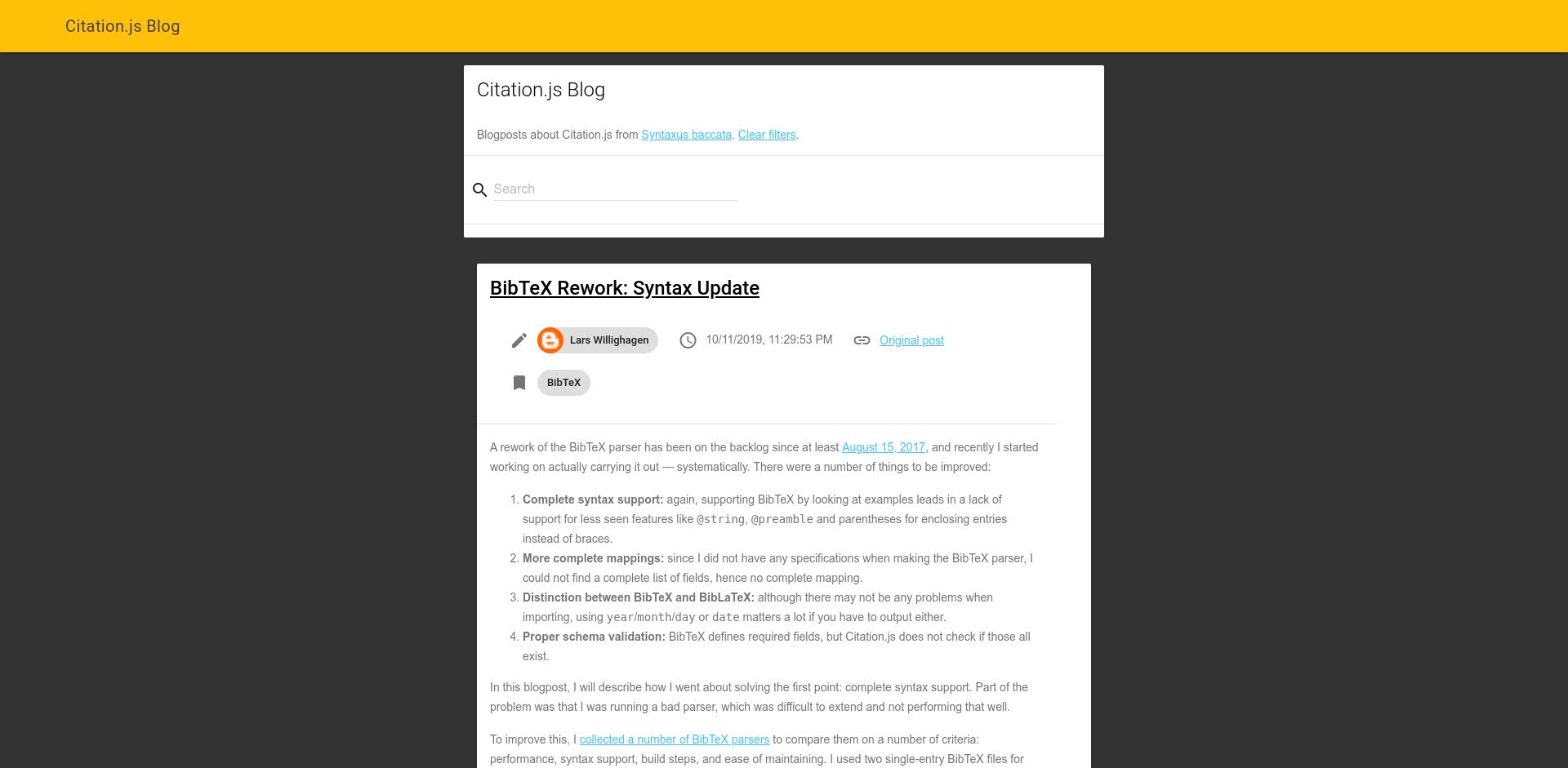
The blog page had the same header, footer, and dark grey background in the old layout, with individual blog posts as cards and the introductory text and search bar as a slightly wider card.
The new layout mirrors the changes to the homepage, especially the white background and full-width code background and the changing of cards to plain text. To the right of the blog content is now a sidebar listing the blog posts per year, which moves to the bottom of the page on narrow screens. Below the search bar is now a clickable list of tags.
Demo page
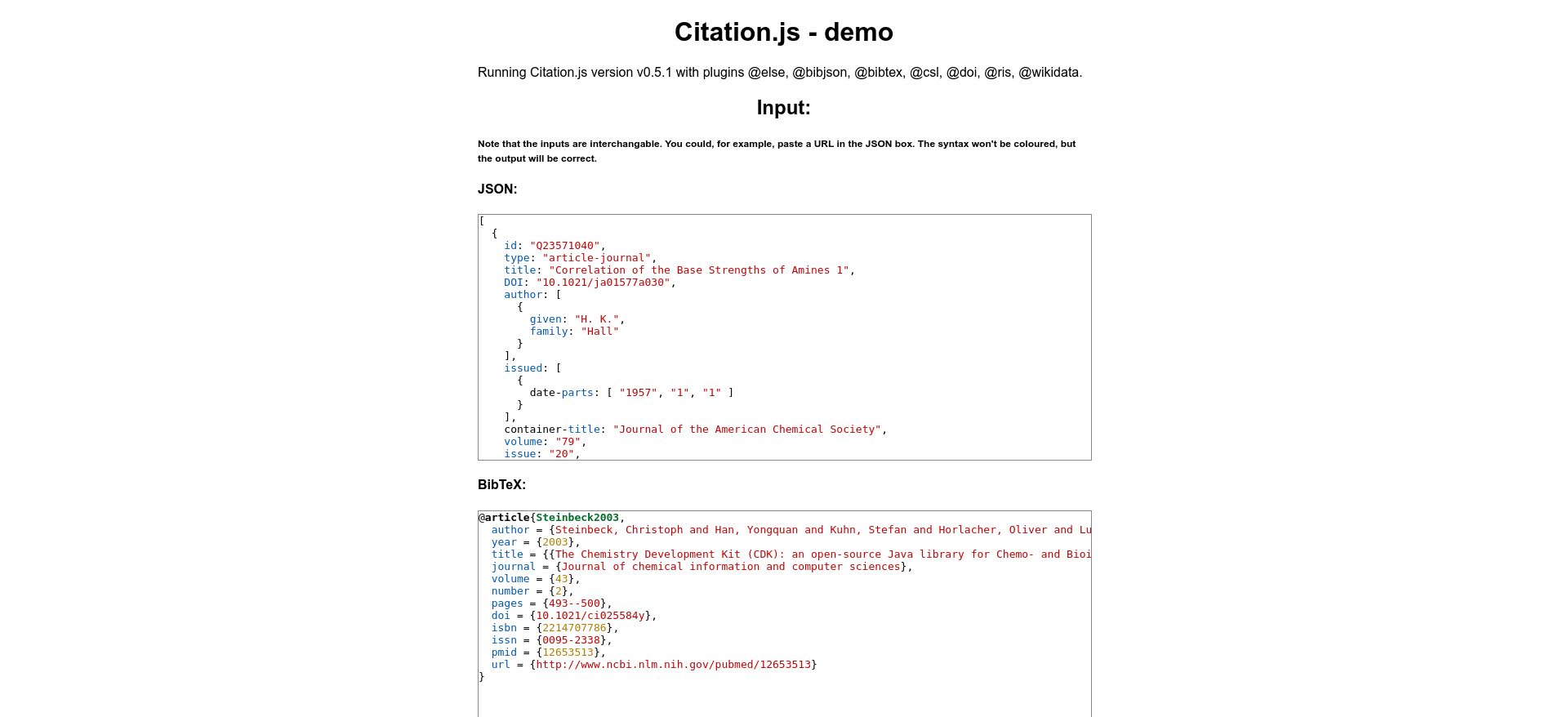
The design of the demo page has not been updated since I made it in April 2016, being more or less plain-text but with paragraphs limited in width and centered.
The new design adds the header, footer, and code background from the homepage as well as some styles for the headers. The interface of the demo is simplified at the cost of easy-to-read code. That also means that the live view of the code is removed.
API documentation
The styles of the home page now also apply to the API documentation.


No comments:
Post a Comment